The Garden of Organic, Morphem-e-graphic Anonymity
[Written on the occasion of Zhongkai Li’s exhibition Prototype I at Is A Gallery (May 28–June 25, 2021).]
Like all human endeavors, the exhibition Prototype I bends aspects of nature. It twists, turns, cuts, displaces and ultimately disrupts trajectories. The manipulation of nature is as old as the human encounter with it. With some research one can locate extant ancient examples across the globe, from the construction of shelter to make the human body safe from the unmolested natural elements, seen in the Chinese word 安全, for complete safety, or “a person in the house is completely safe,” to the transformation of nature into aesthetic objects and spaces, as forms of contemplation, communication and respite and from the outside world as in the case of the Chinese garden. Put plainly, the Chinese garden is a manipulation of nature, it inverts nature’s relationship to humans in that it becomes an object held by them, as opposed to humans being in the world, living within nature.
Like all human endeavors, the exhibition Prototype I bends aspects of nature. It twists, turns, cuts, displaces and ultimately disrupts trajectories. The manipulation of nature is as old as the human encounter with it. With some research one can locate extant ancient examples across the globe, from the construction of shelter to make the human body safe from the unmolested natural elements, seen in the Chinese word 安全, for complete safety, or “a person in the house is completely safe,” to the transformation of nature into aesthetic objects and spaces, as forms of contemplation, communication and respite and from the outside world as in the case of the Chinese garden. Put plainly, the Chinese garden is a manipulation of nature, it inverts nature’s relationship to humans in that it becomes an object held by them, as opposed to humans being in the world, living within nature.
These urban and suburban gardens of “scholars, officials, and merchants served variously as sites of retreat, cultural performance, and for displays of wealth.”1 They created and “cultivated a contrasting atmosphere of isolation and refinement.”2 Where the home cultivates contrast with nature through its protection from it, the garden cultivates contrast with that refinement and protection of the home in its return to a form of mediated nature, a space where the “natural and the artificial were intermingled in very calculated ways,”3 thus, within the garden, nature is tamed and organized—one could say it is “molested” in so far as it is diverted from its natural trajectory.
In Shen Zhou’s “Night Vigil,” he describes the power of sitting alone quietly at night:
On a cold night sleep is very sweet. I woke in the middle of the night, my mind clear and untroubled, and as I was unable to go to sleep again, I put on my clothes and sat facing my flickering lamp . . .
Now tonight all sounds and shapes [shengse] bring this stability and calm [dingjing]. Thus can one purify the mind [xin] and spirit [shen] and realize one's will [zhiyi]. But one should remember that it is not that at other times these sounds and shapes do not exist like this, nor that they do not reach the eye and ear of man, but that appearance is the servant of a thing, and yet the mind hastens to follow it.4
Now tonight all sounds and shapes [shengse] bring this stability and calm [dingjing]. Thus can one purify the mind [xin] and spirit [shen] and realize one's will [zhiyi]. But one should remember that it is not that at other times these sounds and shapes do not exist like this, nor that they do not reach the eye and ear of man, but that appearance is the servant of a thing, and yet the mind hastens to follow it.4
What Shen Zhou describes is a reverence for nature. He speak of “sounds and shapes bringing stability and calm.” Absent his description is however the many potential annoyances of nature that exist beyond his garden that may interrupt his poetic vigil such as snakes, scorpions, centipedes, toads, spiders, or any other number the many potentially lethal intruding phenomena of nature. The artificiality of the garden, because it is spatially manicured, curated nature, it often lacks the aspects of nature most destructive to the human body. Thus, within the safe confines of the garden, nature may be contemplated, reflected upon and appreciated. Here, the garden functions as both window and door—window, in that it presents a framed image of nature and door, in that it allows one to actually pass into it as one would cross the threshold into their courtyard garden. About that night, Shen Zhou writes, one can “purify the mind and spirit and realize one’s will,” but only with the protection from the disturbance of nature’s absolute fullness.
The Eruv allows simultaneous obedience and circumvention of the law unto a spacio-temporal abeyance, and the Chinese garden allows its guest to sit contemplatively within nature, without being subject to the potentially destructive properties of an absolute wilderness, natural law, or the excesses of the social contract appearing in the form of other people, be they in possession of virtuous or depraved desires.
Both of these examples could also be described as traditions of augmenting physical space and nature through material and metaphysical engagement. The garden differentiates itself, as a semi artificial or “molested nature,” from “unmolested-nature;” and the eruv differentiates an orthodox community from the larger community of non-believers, creating a private-public, private space.
+++
+++
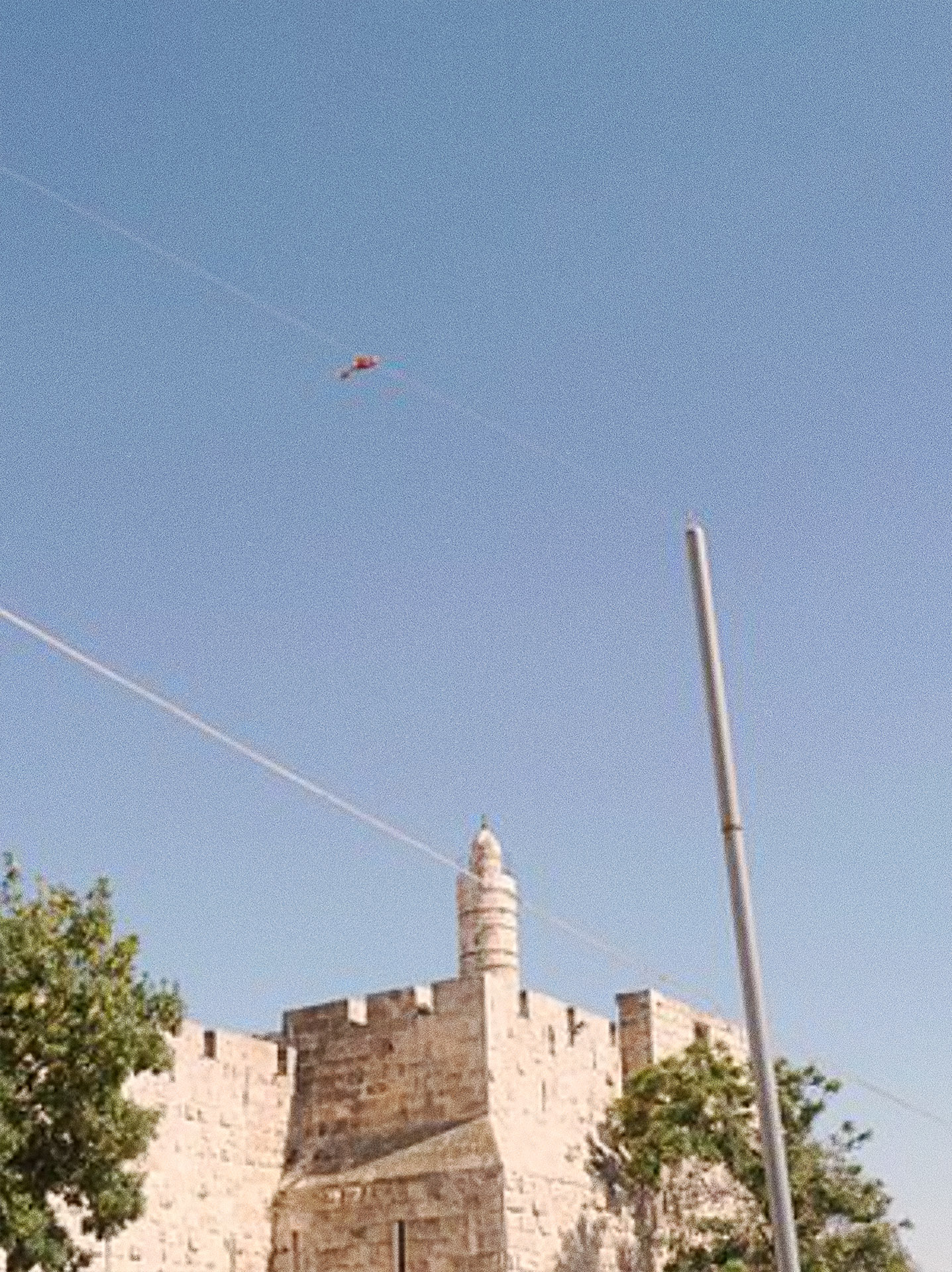
Located in (Ing Park,) the birthplace of modern Chinese fonts and one of the first type foundries in China, Zhongkai Li’s Prototype I exhibition in continues the tradition font creation, and of augmenting space through a Chinese and Japanese Zen philosophic orientation, interested in asymmetry. He exploits Romantic typographic forms and western gardens which utilize glyphs and symmetry.
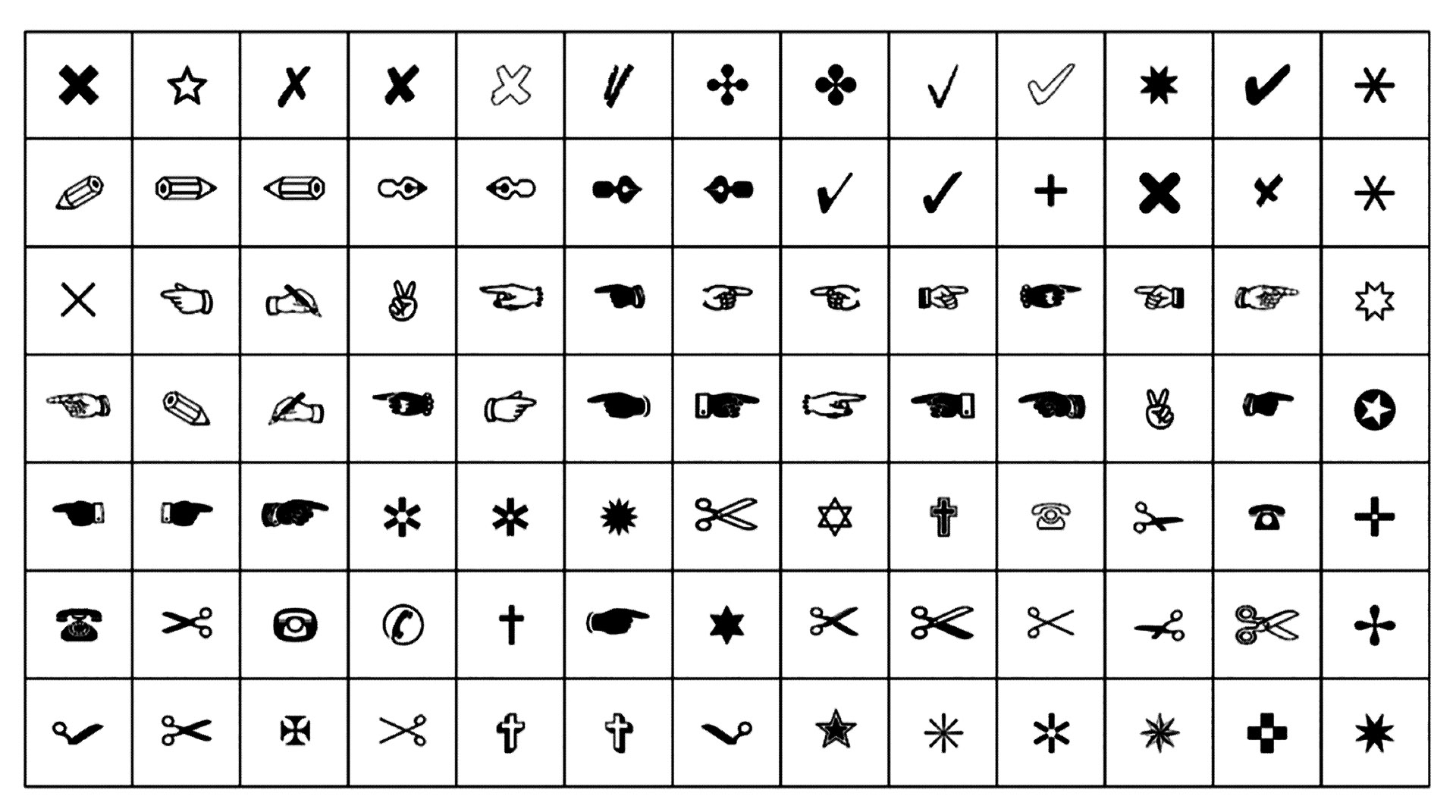
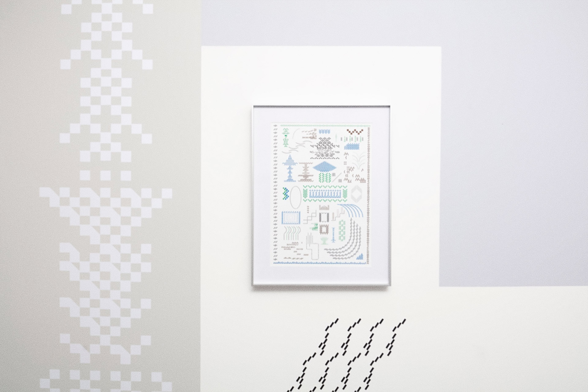
In his exhibition, Li has produced a mural of satin colors, overlaid with vinyl images created with the New Language No. 1. font. This font allows the user to create images which communicate graphic content over syntactic content. Each “glyph” in the font is unrecognizable as romantic glyphs, or Hanzi characters, and also are absent a morphological or syntactic communicative thrust; however, what they do communicate is the graphic affection of a well placed mark, line or shape. Suspending a form of aesthetics—as in a method of communication, for another—the intensity of that communication increases in tandem with the placement and curation of the geometric glyphs within the composition.
Divorce of the mark from its morphemic components, from a semiotic other, opens an opportunity for a relationship with another form of aesthetics, in that because of the divorce from syntax, the graphic components may be applied, considered, described and interrogated for their aesthetic value more acutely. What appears are geometric squares and rectangular shapes, that in some way reference the 1978 Zapf Dingbats script by Hermann Zapf.
The suspension of one consideration, can free up resources to be diverted elsewhere, With these extra resources, Li has brought architectural material inside through Chinese blue brick, geometric constructions placed throughout the gallery. The brick sculptures seem to perform as allusions to the monumental limestones and walkways within a conventional Chinese garden. Yet, never ceasing to betray the analog quality of the allusion, some of these blue bricks also render the two dimensional images in Li’s Risograph prints as three dimensional objects. And although Li’s Brick sculptures are absent the utility of a habitable structure, and lack the artificial erosion of water upon limestone seen in the 供石, scholar rock often present in Chinese gardens, they retain the echo of the mason’s hand in their construction. Li’s creation of a typeface acts as a topos that explores these differences. It acts as a form of mapping when contrasted with some of the sculptural objects in the exhibition. Some of those objects are present in the risograph images as well as the vinyl wall murals.
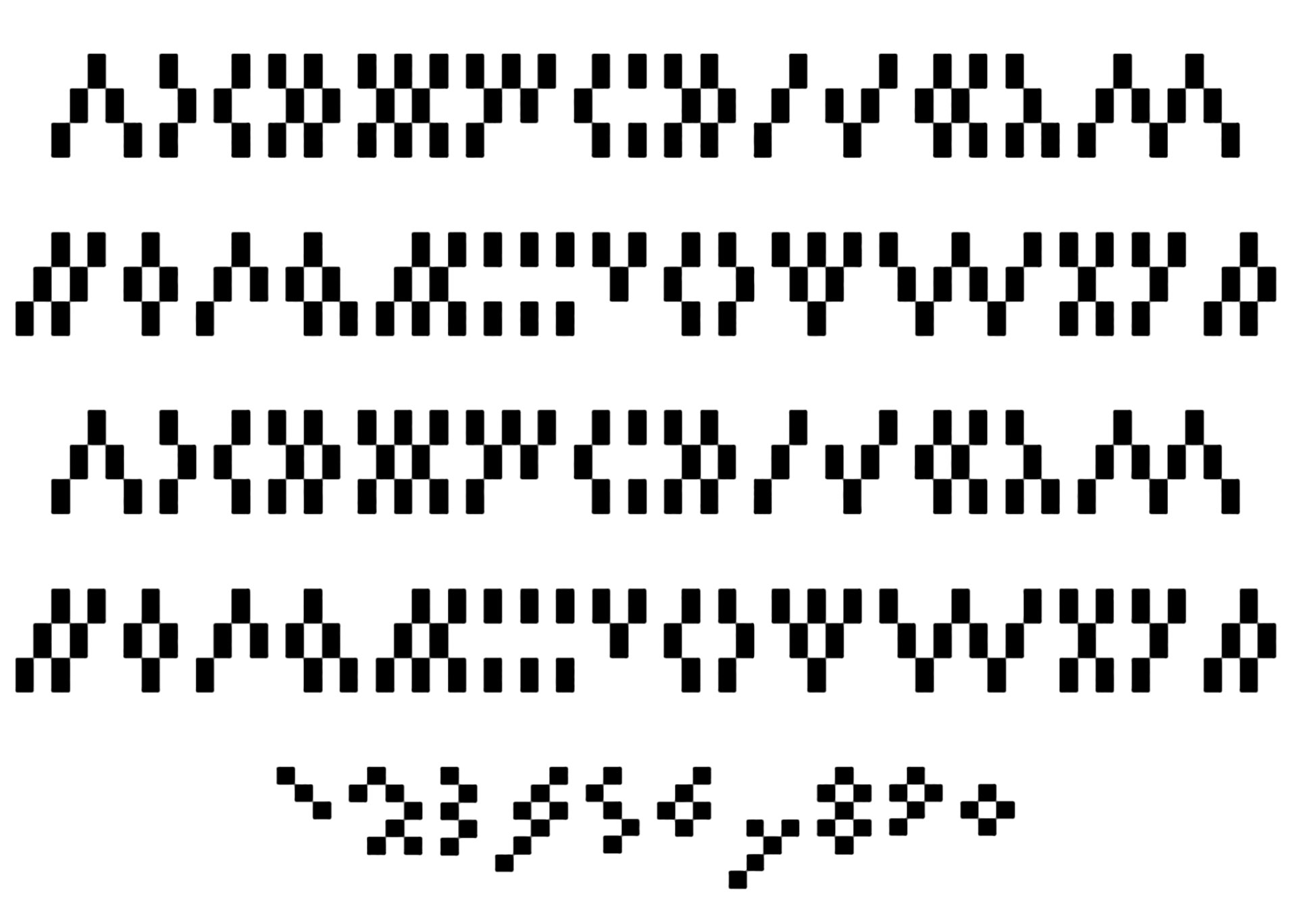
The organic typeface communicates, not mere textual syntactic content, but aesthetic content as in the traditions of calligraphy and some graffiti5 lettering. Calligraphy contains an aesthetic feeling as well as content. Similarly, the now ubiquitous so-called graffiti5 lettering contains aesthetic feeling and content—seen in many of the later letter forms of the late American aerosol paint artist, Michael Lawrence Marrow, who went by, Lonnie Wood, PHASE 2 and True. As John Maizels garnered from his interview with PHASE 2, “his first intention was to get his name known but at the same time remain anonymous.”6 New Language No. 1, has a level of anonymity towards morphemic syntax, and content because the font is composed of geometric shapes, which imply line, tone, depth and form.
1 Robert l. Thorpe, Richard Ellis Vinograd, Chinese Art & Culture (Prentiss Hall Inc., and Harry N. Abrams, Inc. Publishers, 2001), p. 282.
2 Ibid.
3 Ibid.
4 Michael Sullivan, The Three Perfections: Chinese Painting, Poetry and Calligraphy (New York: George Braziller, Inc., 1980), pp. 52–56. From Richard Edwards, The Field of Stones (Washington, D.C., 1962), p. 57.
5 As True said numerous times, “First of all, don’t call it graffiti. Those of us who truly understand the magnitude and depth of this culture would never refer to it as that. What is that terminology supposed to represent anyway? It’s like calling a meteor a pebble. Technically it’s not politically correct, unquestionably due to the fact that from the very beginning we called ourselves ‘writers’ and what we did ‘writing.’” John Maizels, “Writer of the Storm,” Raw Vision. Archived from the original on 08-16-2007. Retrieved 08-19-2021.
6 Ibid.